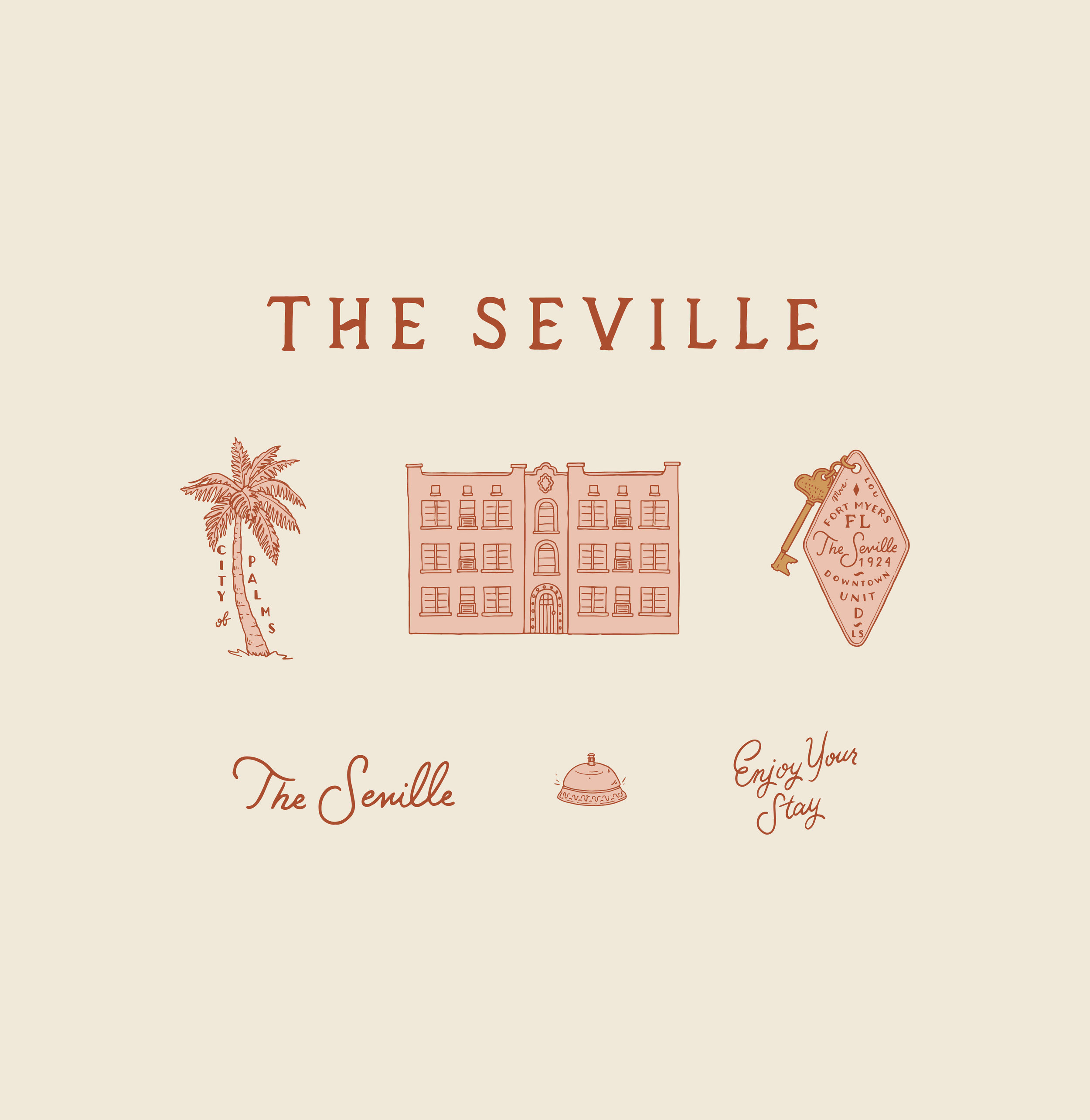
Branding: The Seville / Hotel Concept
Before we moved from Fort Myers, FL to St. Pete, I branded the sweet 1920’s apartment building that Jesús and I called home for the first 2 1/2 years of marriage… because I’m extra like that.
It was hard to say goodbye to this place… the 6 unit apartment built in 1924 to be exact, called The Seville. I’ve loved and continue to love the look and feel of this building so much - all the historic characteristics and details which have stood the test of time. I’ll fondly remember the tiny old mail box slots in the foyer, the arched front door, old staircase that ran up the center, high ceilings, crown molding, original wooden floors, bright windows, original tub, and fire escape - vividly in my memory for the rest of my life. There’s nothing else quite like The Seville in all of Fort Myers. To illustrate and commemorate it in this way sounded super fun to me. I love that The Seville has a permanent home on my website now.

The Seville is located across the street to the Edison Ford Winter Estates, so we weren’t surprised at all to learn that Edison and his wife once walked over from their property for a dinner party invitation from friends.
The aesthetics of these designs were inspired by a 1920’s feeling, naturally (taking it back in time to what I imagine as the best days this place saw) and of course, infused with lots of Wes Anderson vibes.
Here’s a look at my preliminary sketches, before I drew over the logos and illustrations in pen and brought them into my adobe programs for further development:

The Seville currently stands with a faded pink exterior, but I imagined a more vibrant pastel pink in the designs, and based the color palette around this.
The typography came from looking through vintage key tags from other old hotels. The illustrations revolve around the building itself, hotel imagery and the palm tree to represent Fort Myers (aka: The City of Palms).

Aside from the sentimental element of this brand, I also really love the playful yet sophisticated feeling that I get from the set of designs. It would be a true dream of mine to make this whole case study a reality one day, but for now, I’ll happily play with these illustrations/lettering and imagine how beautiful it all could be.

I hope you enjoyed a look at my dear sweet hotel concept for The Seville!
To inquire about bringing your own branding dreams to life, please contact me here or at anna@cheznunez.com with more details!