My Photography Process: Feat. Chez Núñez Presets for Lightroom!
Chez Núñez Lightroom Presets have arrived to the shop and I couldn’t be more excited to feature them here with a blog post about my photography process.
After several years of learning, exploring, and trying new things, I’ve reached a point in my photography and editing where I feel like I’ve honed in on the style I’ve been searching for and I’ve found true excitement over the work that I’ve been producing as a result.
I don’t think I’ll ever stop growing or changing as an artist in these ways - heck, my photos could likely look way different this time next year - but I do feel like I’ve begun to shed that ‘imposter sydrome’ feeling which has held me back from opening up more about what I do know at this stage of my work, and my personal experiences as a photographer.
Step one in this effort: I wanted to make my editing tools openly available for you to apply in your own process and journey as an artist via our CN Lightroom Presets!! My hope is that they’ll provide a great base for your editing exploration or perhaps help you find that finishing touch you’ve been searching for.
Above all - may they save you time, inform your work, and inspire lots of beautiful images.
Now here’s a look at my process!
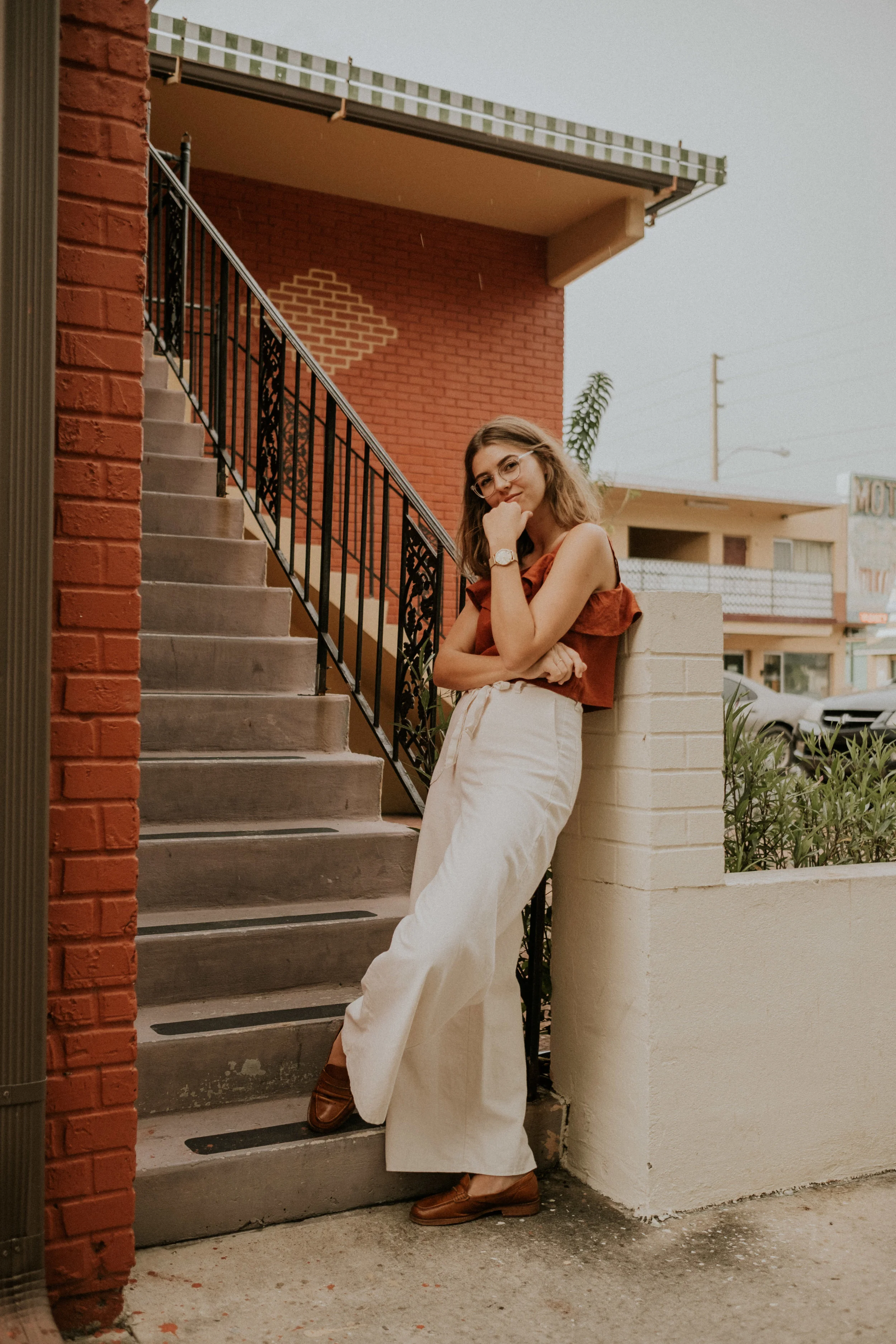
Editted using our Chez Núñez ‘01 Classico’ Preset
Gear:
I use a Fujifilm x-Pro2 with a 23mm f/1.4 lens or 35mm f/1.4 lens.
We’ve had the big Canon setup before, and a Sony A6000, and out of the group, I’ve enjoyed our Fuji the most. Of course, I think gear is all relative to personal preference and desired outcome.We chose the Fujifilm x-Pro2 because we loved the image quality, physical body and its convenient size for traveling!
Our 23mm f/1.4 lens is really perfect for wide travel shots (especially when we’re indoors and I want to take that sly, cute, tabletop shot) and the 35mm f/1.4 lens is a beautiful portrait lens with more of a 50mm look to it. (Side note: the Fujifilm has a cropped sensor making these lens about a 35mm and 50mm equivalent in look.)
Shooting:
I think it goes without saying that I’m all about that natural light, but I’ve been open to experimenting with studio lights or nighttime shots more often lately. Obviously I’m the most comfortable with natural light for now, but I think it’s really important to push myself and be open to the creative result that can come from the discomfort of trying something new.
Batch-shooting is my jam. I find that I can be the most productive in my projects for the blog, Instagram and clients, when I plan out full afternoons at a time to shoot multiple things. This doesn’t always work out, and I know it’s not for everyone - but there’s something sweet to consider about diving head first into a full day of photography instead of breaking it up into sporadic mini-shoots spread out over the course of a week.
To get my creative ideas flowing, I love to play around with styling and shooting flaylays. This category of image is one of my very favorites - alongside interior/travel photos. When working on a flatlay, I really like to style backgrounds with different materials like paper, fabric, or an odd surface like my bathroom sink. There’s so many ways to play and arrange things!
In regards to flatlays, I often think that some of the best props for styled images can be what’s right in front of, or on, me. My rings, my watch, my necklace, my hair scarf, the coffee in my hand, the corner of my sweater. I don’t buy into the idea that someone has to have a storage container full of gorgeous props to style something beautifully. I love to get resourceful!
In order to keep consistent with the ‘gram specifically, I usually try to make sure there’s at least one warm thing in the photo I’m taking - be it a shirt, a building, paper, flowers, any kind of prop to help create some consistency in my work.
Whenever I’m driving around town (to shoot, or not) I always try and make mental note of the colored walls, street corners, or interesting buildings that I could potentially come back to for shoots later on. The blank/colored walls tend to make my best #fauxmural backdrops.
Editing:
I edit all my images with Chez Núñez Lightroom Presets, baby!! ;)
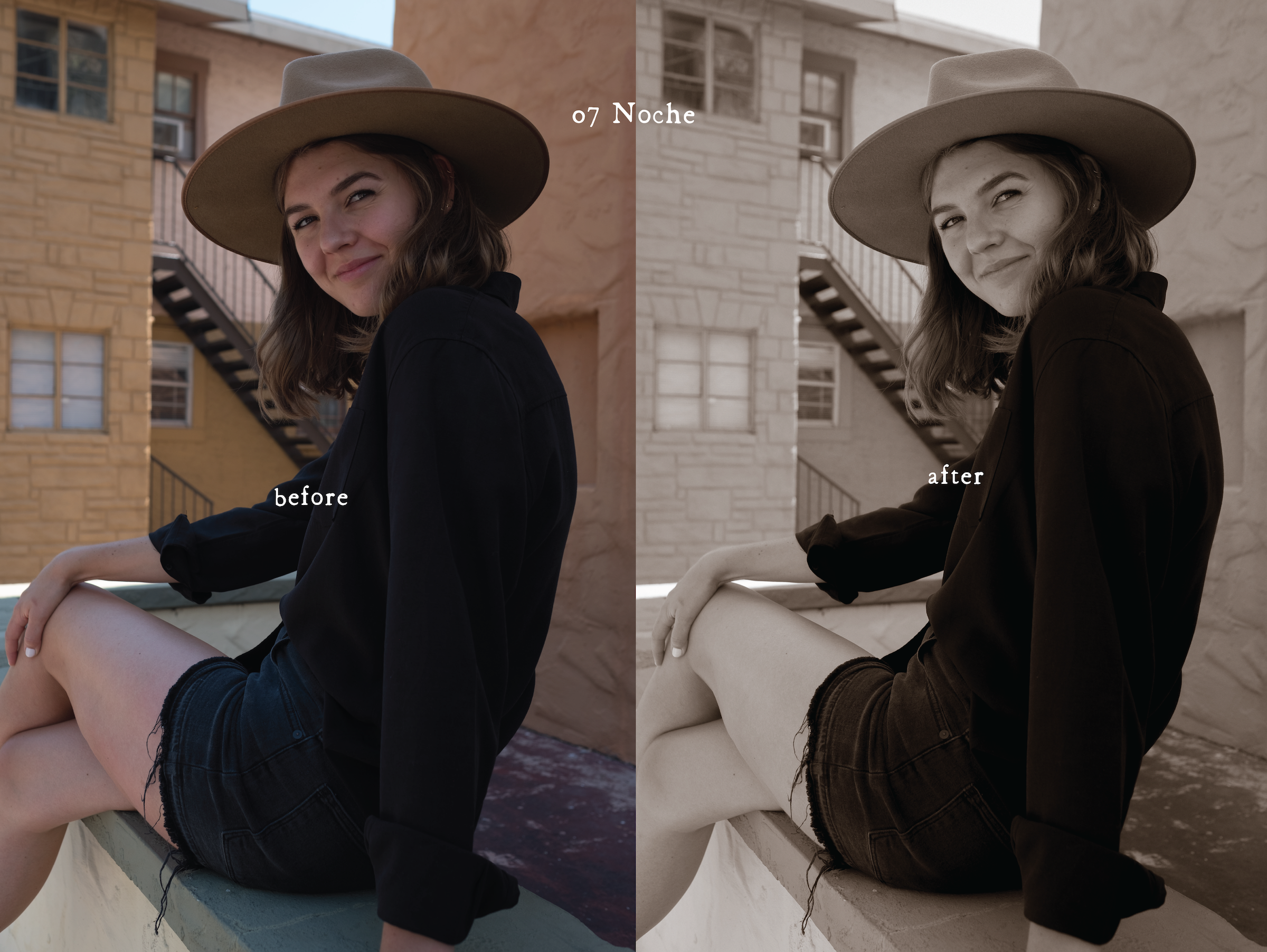
My favorite of the group and the one that I use most often is 01 Classico. 05 Flora is a really close second, and I love 02 Rosado’s pink-y tones. I use presets like 03 Domingo, 06 Puerto and 07 Noche when I’m editing a series of blog post images that I know will live beautifully on my site or Pinterest, without the pressure of matching the images on my Instagram feed.
I typically prefer batch-editing images on Lightroom Desktop, and then tweaking tiny things in each image for Instagram (like color hues) in my Lightroom Mobile app. This process can be pretty tedious (since I love to obsess over images that match), but I’ve been really trying to loosen up lately by doing some more in-phone editing on the go instead.
My general rule of thumb is that I’ll use RAW images, edited in Lightroom (Mobile or Desktop) for my IG feed and blog posts; and iPhone images, edited in Lightroom (Mobile or Desktop) or VSCO for my IG Stories.
To photograph my fine artwork, ironically, I find that the iPhone does the best job.
I hope this look at my process has been helpful. Please feel free to reach out if you have any other questions!
Cheers!


