Branding: Lady Lou / Cafe Concept
Oh Lou. Our Lady Lou.
This French-inspired set of branding elements came to being in my mind first through a funny little rabbit trail of inspirations. I’ll try and keep the story brief - but I really wanted to shed light on my naming process for this one. A usual struggle-turned fun challenge, after I decided to freakin’ loosen up a little bit and follow where the rabbit trail led.
I think that naming things (businesses) can be more exciting than daunting if we just try and let go a bit more.
Story time:
When I decided to embark on my self-assigned homework of creating brands from scratch to challenge and grow myself as a designer, I knew for sure that a cafe had to make the cut. I immediately thought of our beloved apartment building, named “The Seville” after being built in 1924. So the imaginary ‘Seville Cafe’ was the plan. I started sketching and immediately found that the ‘Seville’ name was practically demanding to become something other than a cafe. So I put it aside with that reservation, and opened my mind back up in search for other cafe names. It was a struggle because the ‘Seville Cafe’ had such a solid place in my heart from the get go. Time passed, and then it hit me.
Ms. Lou Sand is the owner of our building. An 80-something lady with a southern accent, a black belt and a firm grip on her real estate investment properties. A spunky woman with a taste for old things. The kind of kindred spirit that the beginning of a confident, elegant brand needed.
Because Ms. Lou is so deeply rooted in her Southern work ethic and assertive demeanor, I decided that the cafe she inspired needed to be infused with a softer, easy-going vibe as well. Enter, my love for the Parisians - a group of people well-known for classic, confident, effortless vibes. The vibes which brought together the finishing touches I needed to give us the full name, “Lady Lou Cafe”.
Lady Lou Brand Identity Guide
Almost everything about the aesthetics of this brand was based around that exact kind of effortless, yet polished influence. I wanted the icons and logos to feel as though they could have been dreamnt up and scribbled out on a napkin, and then brought to life with such delicate and thoughtful consideration.
My love for something else rather French as well - the city of Montreal - was my inspiration for the color palette.
In this process, I also found an exciting new taste for a style of illustrated imagery that really goes against the more intricate, detailed work of my past portfolios.
I’m truly hoping that I get the chance to explore and expand upon this simpler, linear style in many more projects to come this year!
Lady Lou Pattern Design
Next week, I’ll be presenting another close up look at new work for a brand near and dear to my heart.
Hope to see you there!
xo - Anna
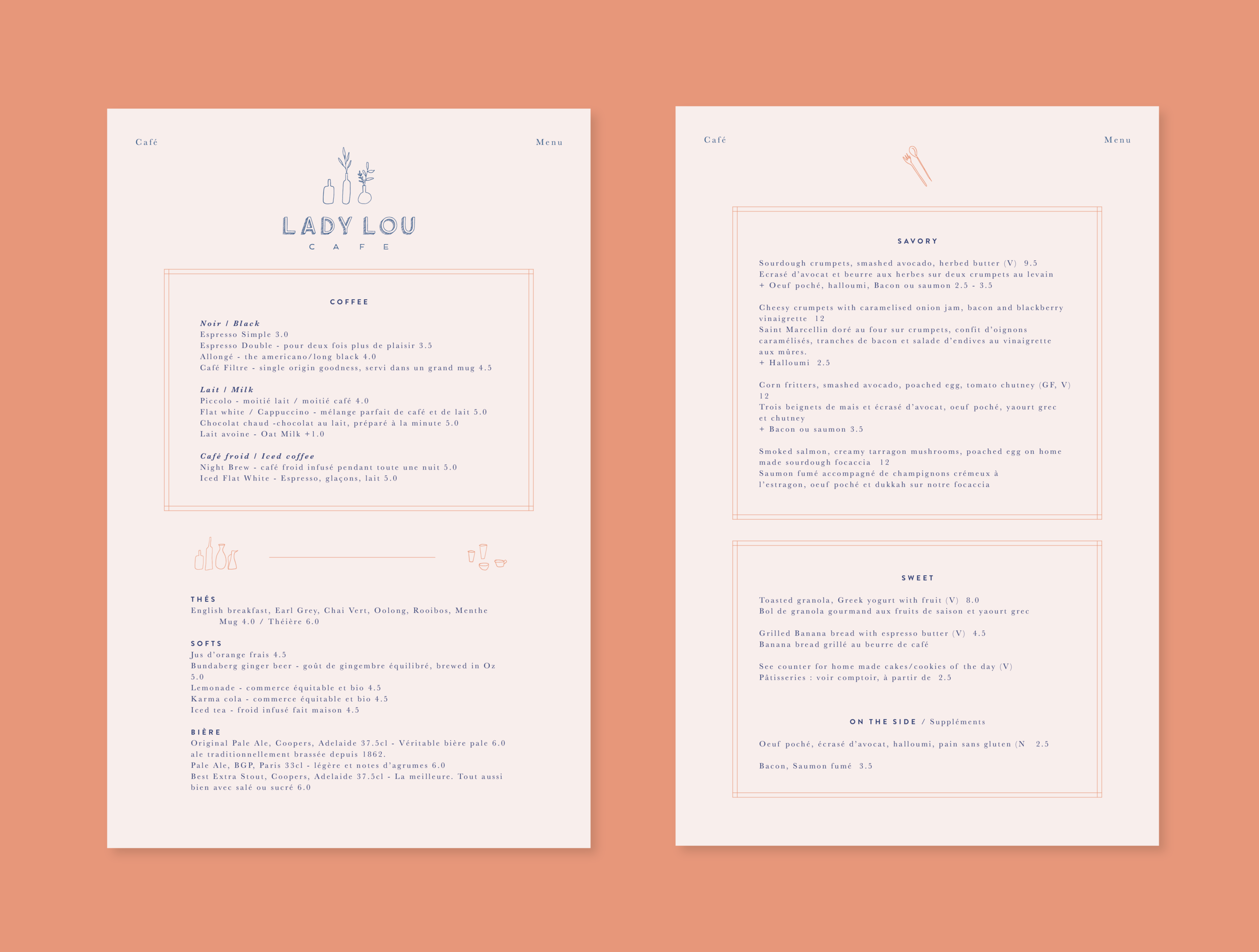
Lady Lou Menu Mock-Up
© 2018 ANNA NÚÑEZ. ALL RIGHTS RESERVED.


