Branding: Refreshing the look of Chez Núñez
My personal brand, Chez Núñez, got a lil massage and facial this winter and ended up walking out of that digital spa with a totally refreshed and updated look.
The spirit of the brand alive and well, but some changes were made to the set of logos and branding elements that I use to tell a visual story around here, so I wanted to share a closer look at the process + outcome!
You know that feeling when you start picking at a project, and then you become quite literally compelled to keep going until before you know it, you’ve peeled off all the wallpaper in your bedroom, or emptied out your entire closet??
Well, that’s kind of how I felt last year when I ventured out on a limb, creating a couple new elements for Chez Núñez. Once I got started, I couldn’t stop. And what I ended up with is an updated brand that I feel delightfully better represents how I feel that I’ve grown as an artist and designer in the last year, and where I’m looking to try and move in this year ahead!
When I was in the middle of my semi-compulsive brand refresh, I knew that there were just some aspects of the Chez Núñez brand that needed to remain the same. My familiar warm and earthy color palette, font pairings, and my references to natural elements were all held dear, and for the most part, left untouched.
As for the logo set on the other hand, I knew that I wanted new looks which could present some fresh, clean and classic vibes. I wanted to work through a style that I’ve found myself drawn to - with heavy focus on typography, and a desire for versatility through the use of clean lines overall.
Editorial fashion advertisements inspired the lettering within my new logos, and a special connection heirloom quality goods led me to a crest-looking shaped logo that I’ll likely be using all the time from here on out.
For the icons, I really think my subconscious new that although my heart longs for the influences of far away places, my home is here in Florida. So the new group became a palm-fron-looking branch, a set of 3 stars, a sun, and some leaves that could very well be withering in that same sun. New to the mix of illustrated elements is also a little batch of continuous abstract line drawings. Which could resemble doodles to some, or the excess string on my mother’s sewing table to me. I think either way is a perfectly lovely way to view them.
Chez Núñez Full Brand Overview
Fun fact about that pattern - it was created using the negative spaces of another brand’s lettering. Spaces that would normally be deleted from within the letters - you know, the inside of a “B” or an ‘O’ - in order to work with the letters themselves. However, once I pulled these negative spaces out from the letters, I found that they made up too pretty of a pattern to be discarded.
I’m sure there’s a metaphor in that somewhere… enjoy -ha.
Chez Núñez Price Guide
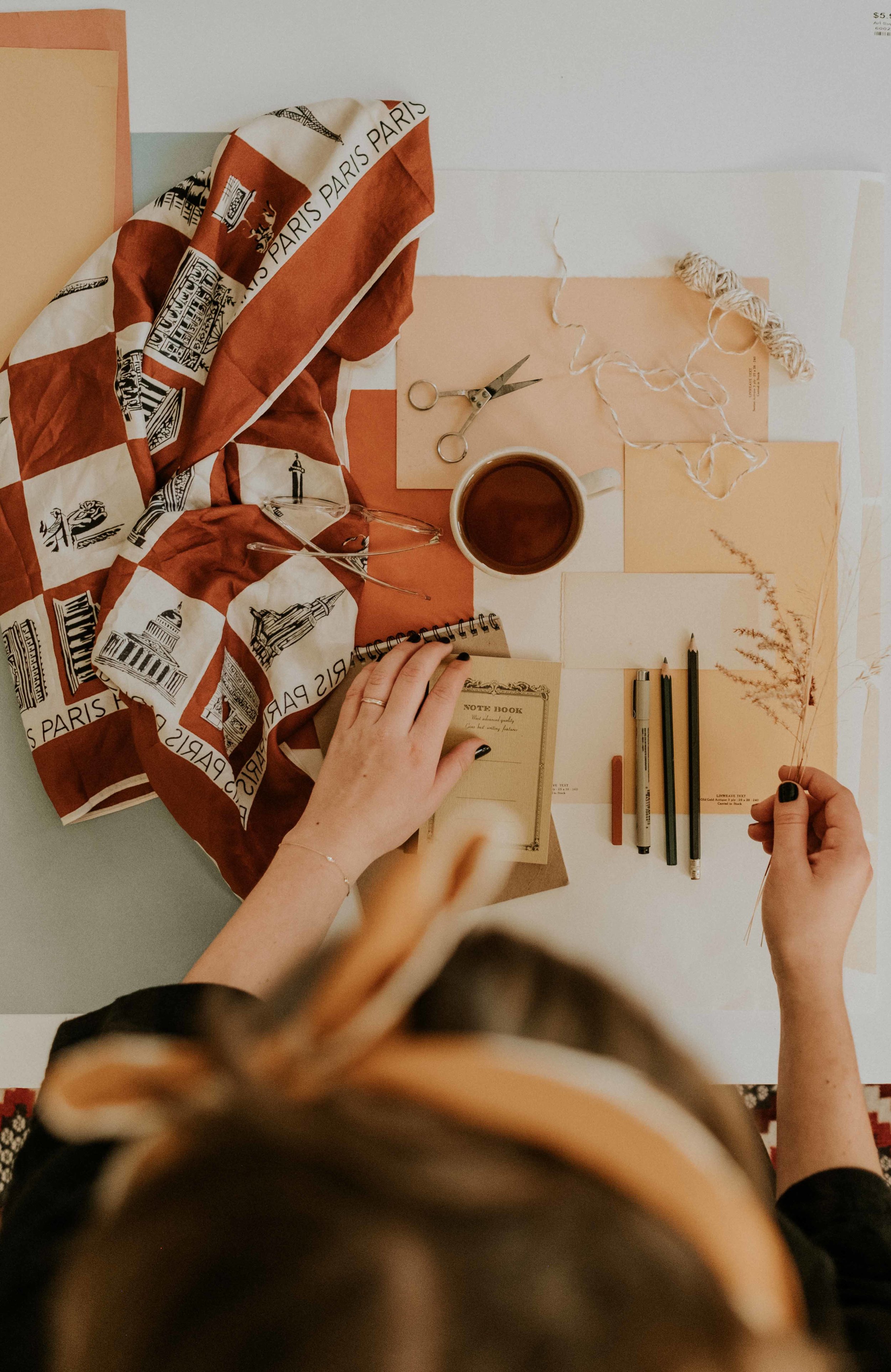
Photography and Styling will always be such an important part of the work I create!
Next week, my final weekly post in this ‘New Year, New Work Series’, will be a look at a brand that perhaps stretched my creativity the most during this whole process.
I can’t wait to share it with you!
Cheers,
Anna
Examples of logo designs from various past projects that were illustrated and designed by Anna Núñez
© 2018 ANNA NÚÑEZ. ALL RIGHTS RESERVED.


